Why adobe doesn't standardize this, I don't know.
A quick overview: What is photoshop elements?
Photoshop elements is a "stripped down" version of photoshop that contains the basic commands needed for photo editing, but does not include the full range of editing options available in photoshop CS. Photoshop elements is sufficient for most hobbyists, while those seeking to take advantage of art and design features should turn to the full version of photoshop. Obviously, photoshop elements is much, much cheaper.
Okay, on to the tutorial!
Step 1: Cropping

Often times we may take a photo, but then decide later that the composition needs some work. That's where cropping comes in handy. Cropping can also be used to change the ratio of the image, making it easier to print (eg, by making it 4x6).
There are several ways to crop in photoshop. The way I find the easiest is to pick the rectangular marquee tool on the left toolbar, outlined in red. This will bring several options up at the top toolbar, which are also outlined in red. For cropping, you will want to change "feather" to "0". You can then adjust your ratio, should you desire. You can use no ratio, or "normal" mode, a fixed ratio, or a fixed size. I have mine set to a fixed ratio of 8x12, for easy printing.
The rectangular marquee changes your mouse to a cross, which you click and drag across the screen to create a rectangle. This rectangle can be moved after you make it. The area outside the rectangle will be cropped out. When you are satisfied, go to the "Image" menu across the top and select "crop."
Again, I apologize for using an old version; these items may not be in the same menus, so you may have to do a bit of hunting.
Step 2: Levels

To bring up the "Levels" tool quickly, simply press CTRL + L. You can also access it from the "enhance" menu, under "adjust lighting." The levels tool will allow you to adjust the exposure of your image.
You can see the histogram of your image in black. You also have 3 triangular pointers that you can adjust: they are coded black for shadows, gray for midtones, and white for highlights. If there is bare space in your histogram, you want to adjust the pointers to eliminate it. I have drawn in red arrows to demonstrate that I moved the white pointer left to where the histogram begins. Similarly, I moved the black pointer right. Let's see what that did.

I have zoomed in here so you can see a little better. Note the new positions of the pointers, as well as the enhanced brightness of the grasshopper.
You will notice that if you close and re-open the levels tool now, the histogram will look different.

Notice how it's broader? This is what you want.
Step 3: Shadows/Highlights
You can access the shadows/highlights tool by going to the Enhance > Adjust Lighting > Shadows/Highlights.

The first thing you may notice is that photoshop for some reason automatically drastically lightens your photo when you bring this toolbar up. To fix this, set "lighten shadows" back to 0 (or to wherever you'd like). You do this by dragging the little round marker left.
If you desire, you can also use this tool to "darken highlights," which does what it says, but I usually don't. I generally just spent step #2, levels, brightening my highlights, so I don't want to undo my hard work!
Finally, I select "midtone contrast" and increase that, usually to 7-10%, depending on the image. Again, just pick the little circle and drag it right. You can also manually type numbers into the percentage boxes.
*Make sure you have the "preview" box on the right checked so that your changes will automatically be applied to your image.
When you are satisfied, click "ok".
Step 4: Duplicate Background Layer
Photoshop uses layers, and while you can do more with this in the full version of photoshop, layers make an appearance in photoshop elements as well. Layers allow you to do many things, including stacking effects, or altering one element of an image without changing another.
Here, we will use the layers tool because it makes our lives a little easier.

What we are going to do is make a copy of the "background." The background is the photo we've been working on - we are going to duplicate it so that we can edit it without worrying about making mistakes.
To duplicate the background, go to the "Layer" menu at the top, then select "duplicate layer." A box similar to the one shown above should pop up. Make sure it says "duplicate background" in the area I've boxed in red. Then, select "okay."
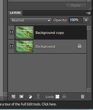
You'll notice in your lower right corner toolbar, you now suddenly have two pictures: One should say "background," while the other says "background copy." This is what you want. The little eye icon to the left of each layer determines whether or not the layer is visible. When it is unclicked, the eye will disappear, and the layer will become invisible.
Step 5: Adjust Color Curves
Curves is one feature that you have much more control over in full photoshop, but it exists in a simplified form in elements. To use this tool, go to: Enhance > Adjust Color > Adjust Color Curves.

A screen like this one should come up. You'll notice there is a "before" and "after" box on the left and right sides of the screen, respectively. This is why I've gone through the trouble of making a duplicate layer - I feel like it's impossible to actually see what you are doing on those tiny screens. With the duplicate layer, you can just overdo it and tone it down later - which is what I intend to do.
To use the Color Curves tool, you must select a style from the list on the bottom left. For basic editing, "default" is the best, but you can play with different styles to create different effects in your images. I have boxed "default" in red.
A graph will come up on the right but you can't actually do anything with it. It's mainly to remind you that adobe thinks you should really buy the full version of photoshop.
The primary thing we are interested in is the sliding toolbars in the center. You can use these to adjust the exposure and the color dynamics of your image. It can be a very powerful photo editing tool, but in elements, it's sort of "dumbed down." But it still works pretty well.
You'll want to adjust the sliders left or right, depending on your preference for your image. I generally increase both highlights and midtone brightness, and decrease midtone contrast and shadows. This tool is less intuitive than levels and requires a bit of tweaking and playing around with. However, because we have our background level copied, we can over-correct without worry.
Step 6: Adjust Layer Opacity
Okay, so now, if you're me, you've over-corrected your image to the point of ridiculousness, so we need to tone that back down.

Remember the layers toolbar I showed you earlier? At the top, there should be a box that says "opacity." I've highlighted it in red for you. Click on that box, and you should be able to adjust the opacity of your edited background copy. I've decreased mine to 45% here, but, again, the value will depend on your preference.
When you are satisfied, go to Layers > Flatten Layers, and you'll be back to having just one layer (your background).
Step 7: Finished Product
Enjoy!

What do you think? Do you use a photo editing program? How do you edit your images? Let me know below!
Did you see last week's article?
Check back next Friday for the next installment of...TwoFeetPhoto. Please remember to share, follow, and subscribe via the fancy sidebar options! Here is my tumblr and here I am on bloglovin.